This project is a somewhat futuristic study case done in 2017, during a semester at college. In addition to presenting the solution made in 2017, I decided to revisit the solution for a 2020 version with the existing data.
In a team of 3 people, I was responsible for the research and development of the product concept, the experience of using the wearable and the application interface.
Develop an application controlled by an wearable for monitoring a person's nutritional level.
Double diamond.
Cognition is the process or faculty of acquiring knowledge, which occurs through perception, attention, association, memory, reasoning, judgment, imagination, thought and language. You can tell that cognition is the way the brain perceives, learns, remembers and thinks about all the information captured through the five senses.
For good cognition, we depend on a functional and healthy physical and mental system. We use some means to maintain a good balance of body nutrition, the best known being the practice of physical exercises and a balanced diet, rich in nutrients.
CSD
Based on this problem, an initial theoretical research was done, mainly to know the concepts involving the health area, how the nutrients behaved and how the cognitive processes happened. After grouping some information, hypotheses of the problem were created, doubts were listed and certainties were defined through a CSD.
With these questions in mind, qualitative research was done. There were five people between 24 and 36 years old in an interview with seven open questions about routine and monitoring nutritional levels.
Grouping the insights from the interviews and the initial research were highlighted:
Insight 1: Time is a crucial factor for people not to dedicate themselves: it would take a quick follow-up. The app would not be for long-term use and the wearable needs to be comfortable.
Insight 2 and 3: Maintaining a good diet depends on routine and habit; people would like to know what they need to eat to improve their daily lives: it would be necessary to indicate which foods need to be consumed to improve the cognitive process.
Insight 4: It is difficult to take information to the doctor when routine examinations are done: it would be interesting to keep a record of the data collected.
Insight 5: Knowing the percentage of the current level is the most important: it would be necessary to indicate the percentage at the levels provided in reading the program.
Insight 6: People mainly want to know vitamins, nutrients and minerals: the data could be shown in the program.
Although the proposal is something that currently does not exist, I chose to look for similar ones that would do nutritional monitoring. There are several applications available that do this monitoring and, to understand what problems they solved, I set up an analysis of some main competitors to broaden the perspective of the subject.
Similar 1: Calorie counter
It aims to help people lose weight. Calculates the amount of calories consumed throughout the day retroactively.
👍 Positive: gives a percentage of the nutrients consumed.
👎 Negative: the person has to popularize the food for food app.
Similar 2: Yazio
It also calculates the amount of calories consumed throughout the day retroactively.
👍 Positive: gives the possibility to add a focus / objective to follow.
👎 Negative: the person also has to popular the food for food app.
Similar 3: Samsung Health
Calculates the amount of calories consumed, monitors calorie burn, physical exercises, standing time, sitting time, sleep time according to the records made through a watch (wearable).
👍 Positive: shows analysis reports of daily calculations; the data are entered using the clock, that is, there is no need to add data retroactively; has a ranking among your contacts.
👎 Negative: has problems with the update and a low grade due to performance.
Based on the research, two profiles of people who would be interested in using the product were defined:
Persona 1
The first persona is based on a profile recently arrived in the market with a focus on balancing personal interests and dedication to career building, ends up having problems with attention due to the anxiety of growing in the career.
Persona 2
The second persona also has personal motivations, but he is a workaholic (someone who works too much) and does not have time to dedicate himself to good food and health. He always comes home tired and ends up losing focus throughout the day, damaging his work.
How to maintain a good nutritional balance when we are busy with our own routines? How can we monitor these levels and improve our diet?
The main value that the product adds would be to improve people's perception of their own bodies and also to improve cognition for specific goals, such as focus, attention and perception.
To develop the solution, it was first thought about the journey of using the wearable and the application to use, then how the wearable would be physically, and how the application would work and be visually.
Based on the research, a product usage scheme has been developed: the first step is to always carry the product for use over the days or weeks and then position the product on some part of the body with great blood circulation, such as neck or wrist.
It would be possible to activate the product without necessarily calculating through the application, but the visualization of all levels would be done by cell phone.
The monitoring of the nutritional level would be done by the application. It is necessary to open the application, log in or go to the menu, calculate nutritional levels or consult previous records, and then exit the application.
To define the prioritization of what needed to be launched, I used a Moscow matrix: it must have, should have, could have and could have (must have, should have, could have and want).
In addition, to make decisions, I also used the main objectives of each persona (jobs to be done) as a basis and what would generate greater value in less time.
The first would be those that would need to be delivered first, then the second, and so on.
As I mentioned at the beginning of this article, the basis of the project was made in 2017. Here I show the product solution and the first UI proposal, and then the version made in 2020.
The wearable
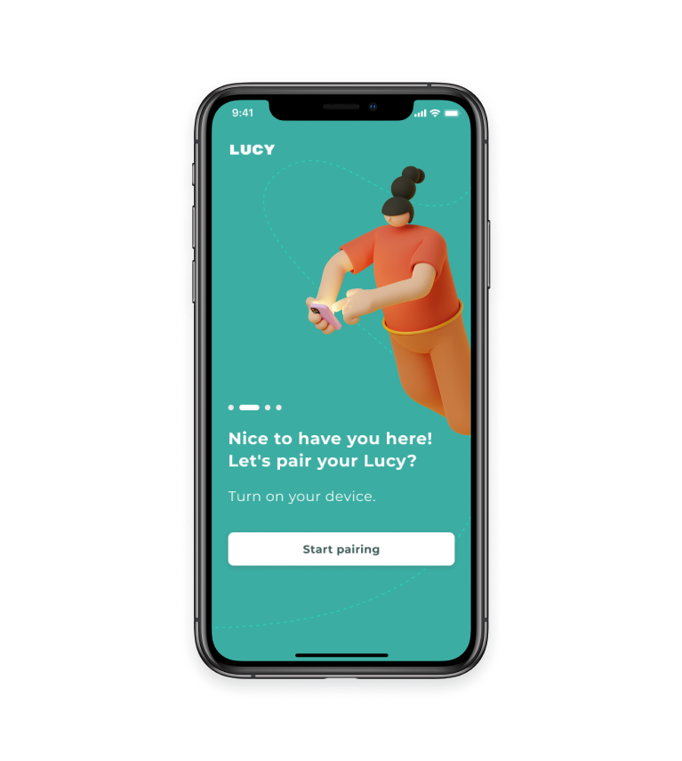
Lucy is a wearable designed to instantly calculate the level of deficiency of minerals, substances and vitamins in the bloodstream. It works with the application and it can be placed in areas with high blood flow, such as the wrist and neck.
It is activated through its main button and has an oximeter as reader.
2017 app solution
Along with the wearable, the app should be used to also calculate levels and track records. The 2017 proposal brings the main flows of use with the calculation, calculation results, menu, record and feed with news related to health.
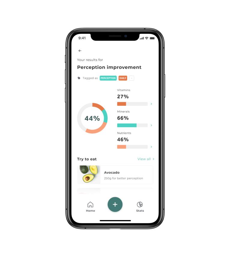
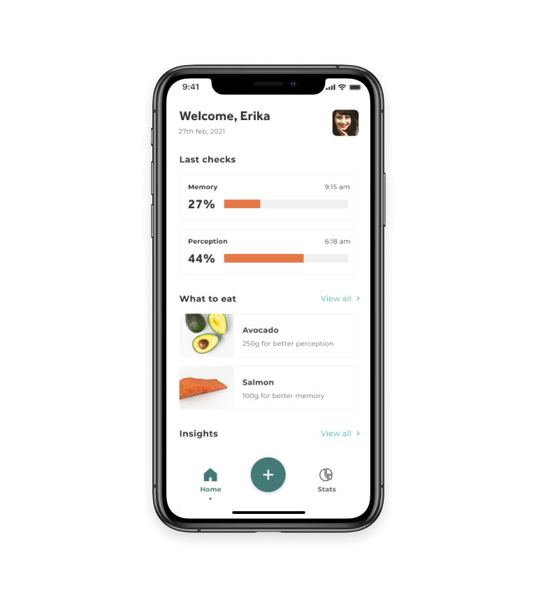
For the redesign of the solution, I opted for a simpler first version, with the main features to test quickly, just with a new experience.
I started with wireframes, with the basic structure, small navigations and interactions that I had not gone through in the previous version.
SIGN UP


TRACK NUTRITIONAL LEVELS
TRACK EVERYTHING

I revisited and decreased the amount of product functionality and then started the prototype.
I separated the development between the flows, counting on the parts to calculate nutrients, the programs to calculate, the visualisation of results, the flow of login, registration and onboarding, profile and usage statistics.
First I made a simple version, in low fidelity, to evaluate the size of the first delivery and the number of screens. Then I defined the images, colours, texts, components, following the best UI practices, accessibility, contrast and heuristics.
I used our dear Figma to create the components and the UI system of the screen. The system, in principle, has fonts and their sizes, spacing, grids, buttons, inputs, select, icons and colors.
As the wearable could not be tested in practice, I chose to test it only with the objective of understanding the ease of use of the application, if the navigation was making sense, if the texts were clear and if there was something missing in the flows.
After testing with 5 people, the app scored 4.5 (on a 1-5 scale) for ease. I encountered two problems, which were not necessarily problems, but which could be added in later releases:
Insight 1: Details of everything that made up the percentages of vitamins, minerals and nutrients. For example, what is the percentage of vitamin D supplied? In the previous version I had it and I chose to remove it in this first version because it was not crucial to test.
Insight 2: The lack of a generic or customized program. In the other version it had a generic program and, for the same reason as the previous insight, it was not for that version because of priority.
For metrics, I decided to use the HEART Framework, separating my goals through happiness, engagement, adoption, retention and task success.
Also it's possible to use NPS, SUS or UMux together to track some usability metrics.
After going through the new experience, I started thinking about not only the next stages of delivery, but also de possible adverse scenarios that could happen.
Thinking about adverse scenarios helps to understand the product in practice and think about solutions beforehand.
Scenario 1: People downloading the app without wearing Lucy wearable;
Scenario 2: What to do if the wearable is unable to pair with the application;
Scenario 3: How the application should behave to be more accessible to people with other needs;
Scenario 4: What happens if the person removes the wearable before completing the calculation;
With these questions I would have enough work to talk to more people, test other versions and delve into the functionality of using the application.
Lucy was the first case study with which I had the opportunity to practice a product with a digital interface. It was interesting to revisit the project and, even now that I have a little more experience, it is fun to realize that the essence has remained the same: getting people to solve their needs. I separated some learnings that I had reformulating Lucy.
Learning 1: Reduce complexity. Simple and well done is much better than slow and complex. With a little more practical experience, understanding more about continuous discovery and not having to launch everything at once.
Learning 2: Creating a component system made it VERY easier when creating the screens.
Learning 3: You can always refine and refine your process. It is not always possible to get it right the first time, so I went over a few times what was done and even now, in 2020, I reviewed several techniques and methodologies to go through the study.
debsperandio@hotmail.com